a design language · web, native and the desktop
Straight lines, live tiles, sideways motion.
one token source · two independent themes · four status fills · no framework
Rekta Design is a design language for software that shows a lot and stays calm. Its name is Latin recta, the straight line: sharp edges, a strict grid, nothing rounded off. It is defined once, as tokens and rules, and comes three ways: CSS and a script for the web, rekta-core, a C library for native desktop apps, and a theme for the whole KDE Plasma desktop.
Move sideways with the mouse wheel, a trackpad swipe, or ← → once the panorama has focus; on a phone, scroll down. A tile that opens something nudges back where you press it, and the place turns.
Nothing is decoration.
- content over chromeNo cards, no boxed panels. Information sits right on the ground, grouped by hairlines and whitespace.
- motion as guidanceEvery transition answers one question: where am I, which facet, what just happened. None of them is there to look nice.
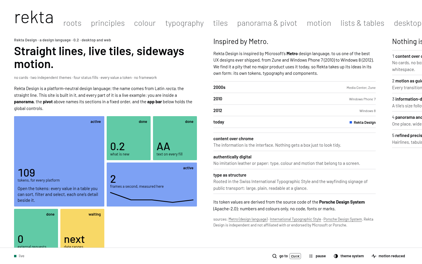
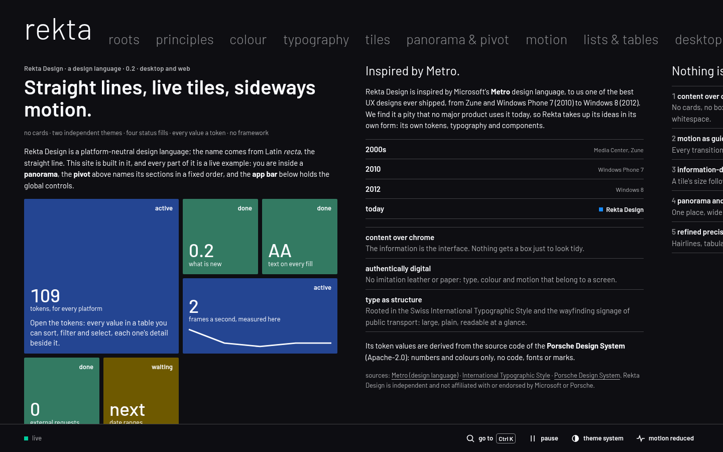
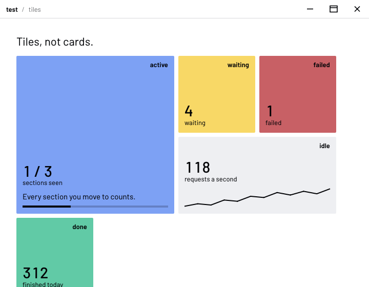
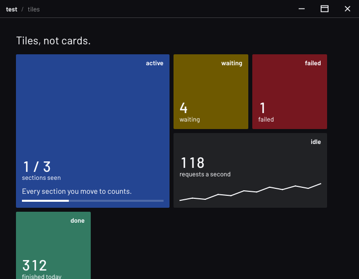
- information-dense live tilesA tile's size follows importance; its fill is its status. It opens something, or it only informs.
- panorama and pivotOne place, wider than the screen, moved through sideways; its facets in a fixed order. You are inside one.
- refined precisionHairlines, tabular figures, calm large areas, vivid small accents.
roots
Rekta takes up the ideas of Microsoft's Metro, from Zune and Windows Phone 7 to Windows 8, in its own form: its own tokens, type and components. Type as structure comes from the Swiss International Typographic Style and the signage of public transport: large, plain, readable at a glance.
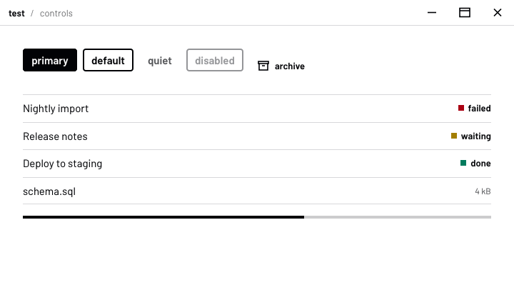
Status is a fill, not an accent.
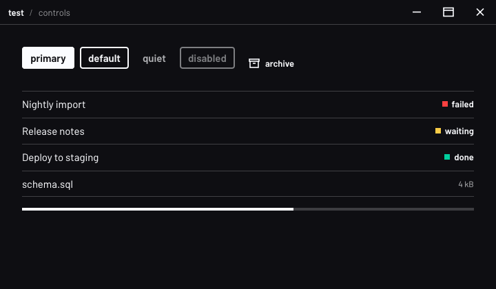
The ground is neutral and has no brand hue. Four status colours carry meaning, and only meaning: a tile's whole area is one fill, and the fill is its status. The word is always there too, so nothing depends on seeing colour. Primary text clears AA on every fill, in both themes.
three levels, one bold title
board · updated 2 min ago
Migrate the nightly import
3 of 5 steps · failed at the schema check · 4 comments
A quiet kicker, one semibold title per screen, a fact line. Navigation titles, like the strip above, are large and light: they name a place, not a thing. UI words are lowercase; content keeps its own case. The type is Barlow.
Every transition means one thing.
- place changeA page turned in a book: you are somewhere else. Light parts go first, heavy ones later. Press a tile on the first section to see it.
- pressThe tile tilts back where you press it: this heard you.
- build-inTiles rise a few pixels, one after another: this view is assembling itself.
- peek and flipA new number comes up from below; a new status turns the tile over.
- reduced motionEvery step becomes instant, and none is skipped.
One source, three ways out.
Every colour, size, radius, duration and curve is a token, in one file. Each platform feeds the same numbers into its own drawing: nothing is invented twice.
- tokens
rekta.tokens.json, resolved for any platform: WinUI, Qt, SwiftUI, Compose, Flutter or a terminal. - the web
rekta.cssandrekta.js: components and behaviour, no framework, any framework. - native apps
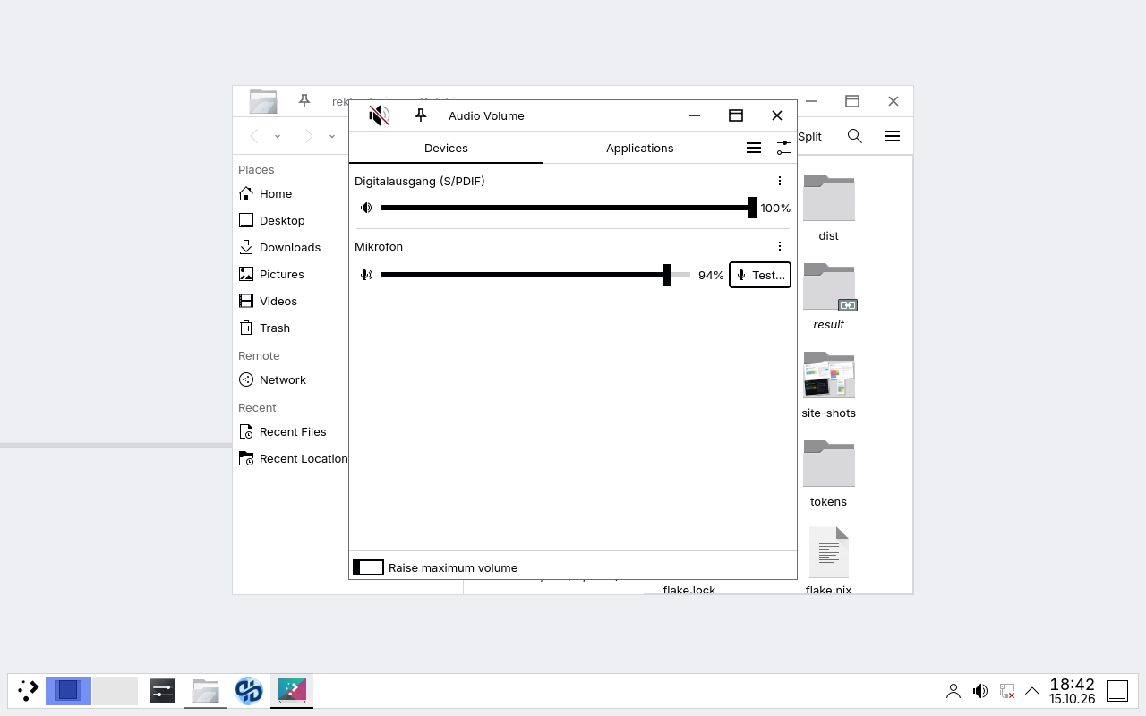
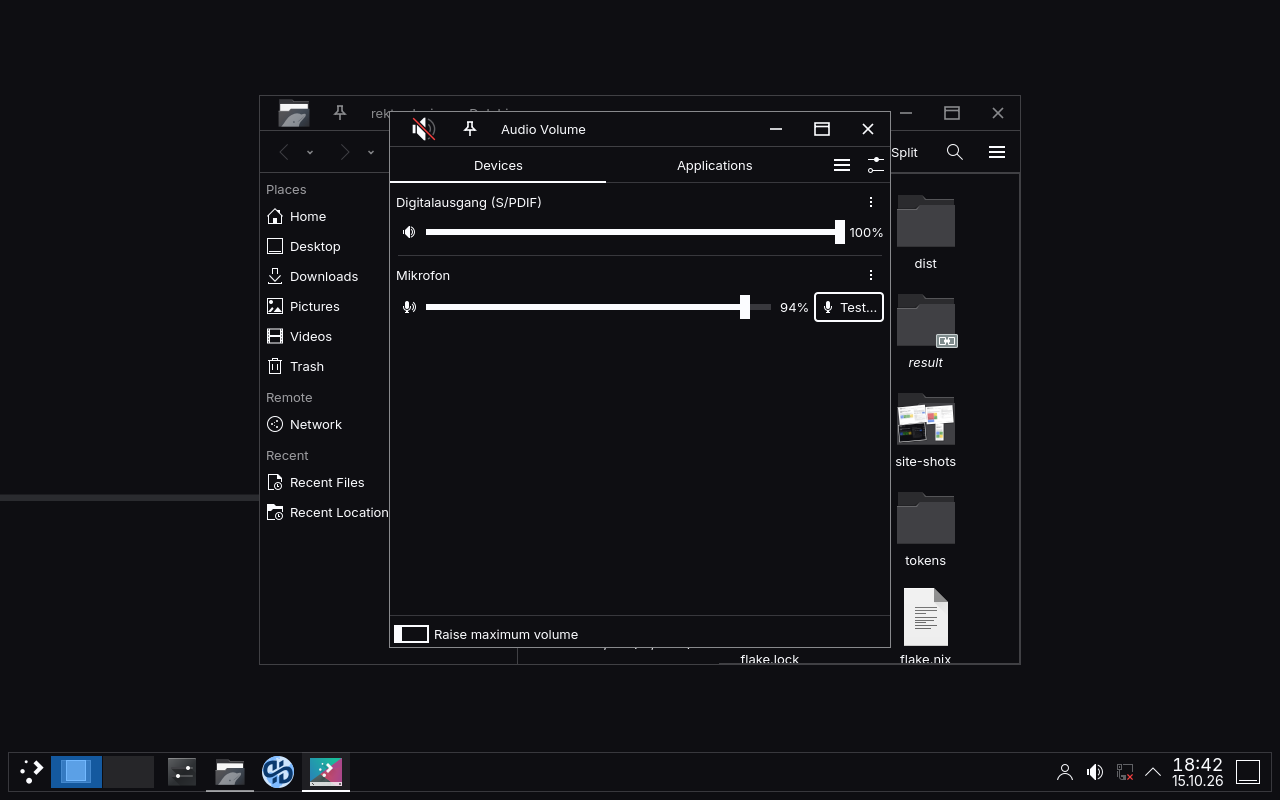
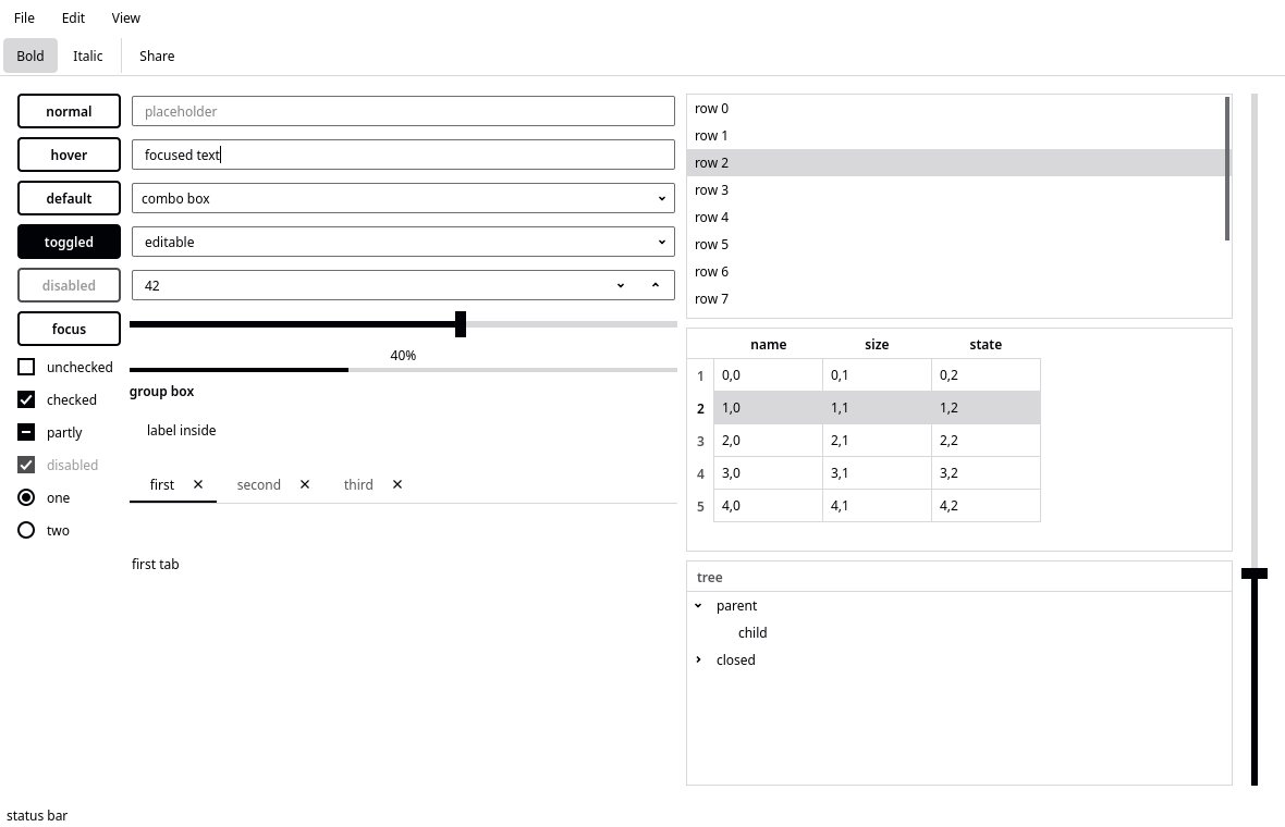
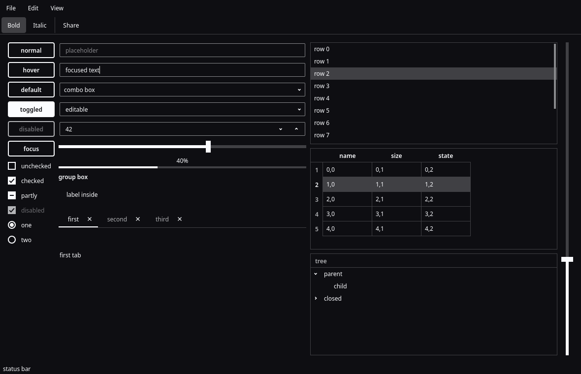
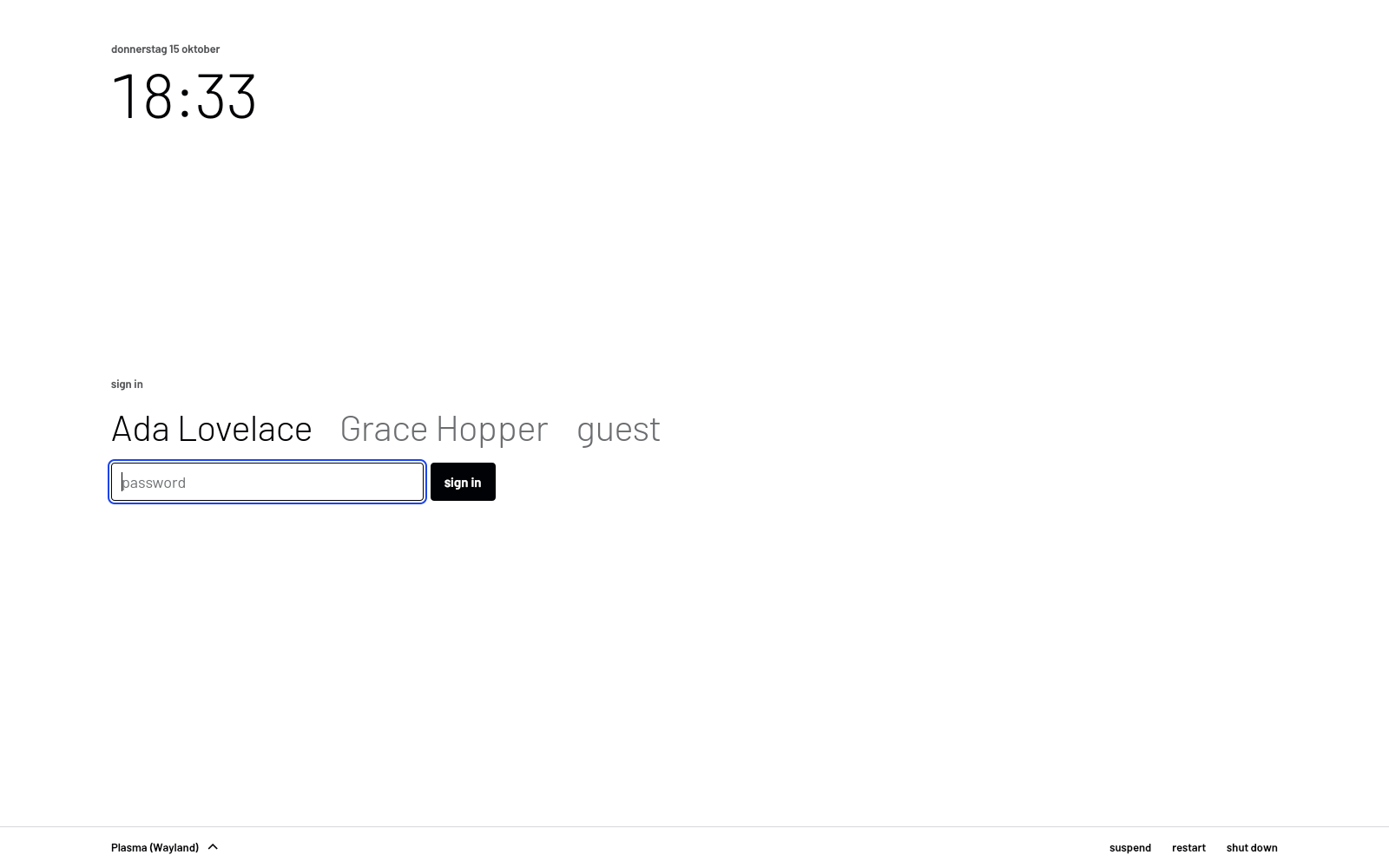
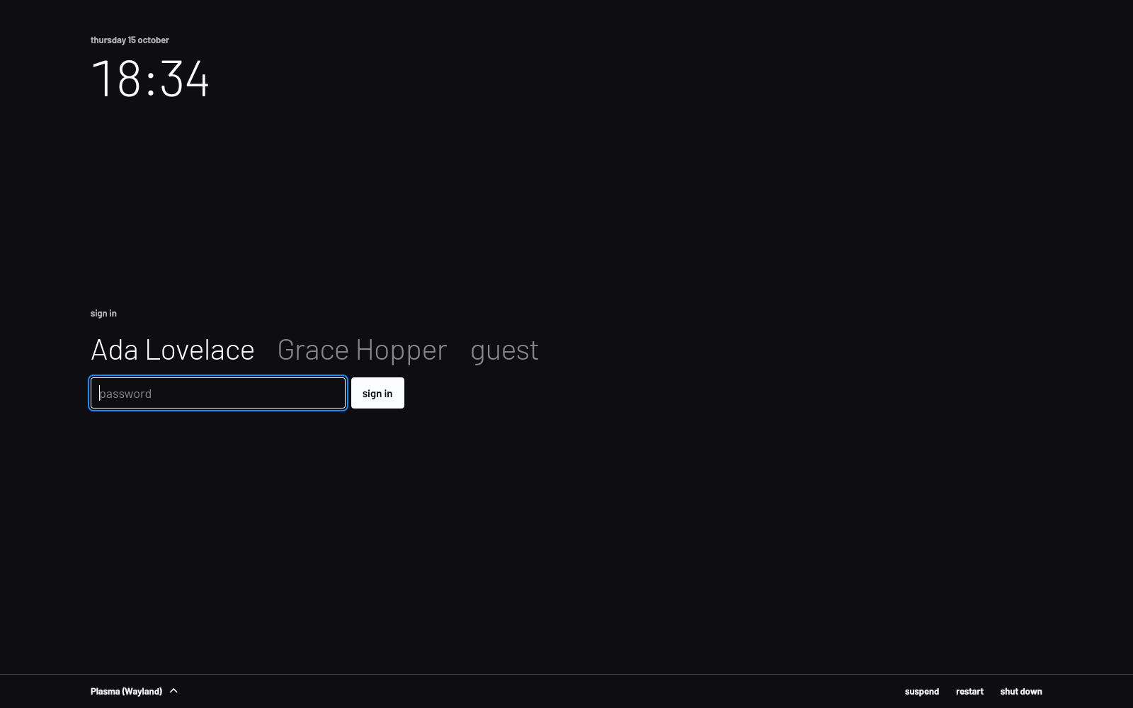
rekta-core: a C99 library for Windows, macOS and Linux, drawn the same everywhere. - the desktopKDE Plasma 6: colour schemes, Plasma Style, title bar, Kvantum style, splash, wallpaper and login screen.
Take it.
- read the sourcegithub.com/DerDaehne/Rekta-Design: tokens, docs, the web build, rekta-core and the KDE theme.
- try the native demoWith Nix:
nix run github:DerDaehne/Rekta-Design - walk through every componentthe showcase, built in Rekta itself.
Code, tokens, CSS and script: MIT. Docs and images: CC BY 4.0. Barlow: SIL Open Font License 1.1. Some token values derive from the Porsche Design System (Apache-2.0), values only. Rekta Design is independent and not affiliated with or endorsed by Microsoft or Porsche.